This review can be summed up by giving it a different title.
Batman vs Superman: It’s Not as Bad as All That, But Please Can We Have Some Color?
Here are some selling points, although based on the film’s domestic gross, Time/Warner/DC does not need my help selling the movie to an English-speaking audience:
- Very long, but not boring
- Luxuriously paced, and every scene matters
- Very good performances from the principals
- Great soundtrack
- Solid story
- Gal Gadot’s Wonder Woman is delightful
- Maybe—maybe—even perfect
The biggest downer is the absence of color. It’s like Metropolis, Gotham, and DC are all perpetually overcast. Even indoors. There are a few scenes that feel like they could have been set in our world, like an early scene in the Indian Ocean that had the blazing cerulean, teal, and green colors we associate with the tropics, but for the most part everything was muted to the point of being largely desaturated.
Here are a couple of examples:
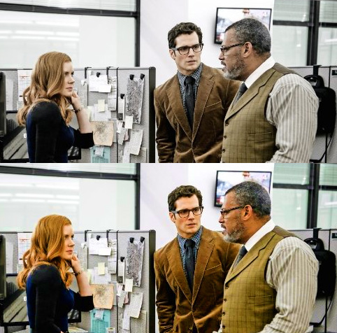
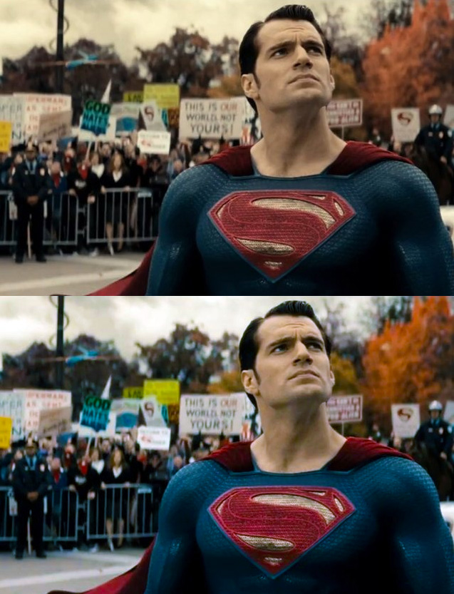
I’m reminded of a line from Trumbo, in which the titular character says “if every scene is brilliant, your movie will be boring.” By the same token, if every scene is bleak, we lose the sense of what “bleak” means. Yes, it’s pretty dark when a genuinely nefarious plot results in two powerful men with genuinely good intentions attempting to kill one another. But for that to really leach hope from us, there needs to be some color beforehand, a visual representation of the hope that is drained as the plot unfolds. And if we’re going to stand up and cheer at some point, if there’s going to be triumph—even one coming at significant cost—the color should flow back into the film.
VideoLab said this pretty well already when they gave us some Man of Steel shots with the color restored. Their conclusion: “Superman should fly in blue skies, not grey.” I agree.
Does the film have problems besides color? Oh, absolutely! Other critics have explored a great many of these in detail. All I have to say here¹ is that most of those didn’t detract from my enjoyment of the film. They may have prevented it from clearing the Threshold of Awesome (on the “fun” scale it’s very middle-ground) but, for me at least, they didn’t drag it across the Threshold of Disappointment and into the abyss.
¹Okay, not quite all. There’s a moment of absolute Bechdel failure² in which the film’s two dominant women—Wonder Woman and Lois Lane—don’t even speak. They just share a look, and yes, it’s totally about a man. And it’s their only communication in the film.
²Bechdel failure is not automatic film failure for me, but it’s a solid indicator of something being deeply wrong.