I’m at GenCon Indy this weekend. I arrived on Tuesday for setup, and don’t fly home until Monday the 18th, and yes, this means the convention is eating a week of buffer. Like a voracious monster with 70,000 mouths…
I’m in Booth 1437 with Jim Zub and Tracy Hickman. We’re pretty much smack-dab in the center of the exhibit hall, facing the Asmodee folks.
Is there convention-exclusive merchandise? Yes, there is!
(Note: for those unable to attend GenCon, these exclusives can be purchased during the month of August if you’ve got the “Schlock Troops” level of patronage ($2.50/mo) over on Patreon.)
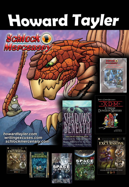
We’ll have plenty of other goodies, including the sale-priced ten-book bundle, and the latest Schlock Mercenary title, Longshoreman of the Apocalypse, and not only can you get me to sketch in the back of that at no charge, Zub can sign it for you too! He wrote the bonus story (and it is awesome).
Zub will have Skullkickers collections, and will happily tell you all about Wayward, his new project. He’l also be signing comic books galore – Pathfinder, Samurai Jack, Figment, Skullkickers, and more – and maybe, just maybe you’ll be able to coax a commission out of him. (Hint: use money.)
Tracy will be signing books and books and books (thirty years of writing will do that), and will have his Sojourner Tales game! Brand new!
My schedule is pretty packed. If you have to pick just one thing, you should pick my solo presentation at 7pm on Thursday, “Crafting Humor for the Page.”
Here’s my full schedule:
THURSDAY
- 12pm — Room 245: Cliches and Stereotypes, with Susan Morris, Erin Evans, David B. Coe, and Brad Beaulieu
- 1pm-6pm — Booth 1437 (with occasional breaks)
- 7pm — Room 245: Crafting Humor for the Page, my solo presentation!
FRIDAY
- 10am-1pm — Booth 1437
- 2pm — Room 243: Author Networking 101, with Kerrie Hughes, Kameron Hurley, Marc Tassin, and Carrie Harris
- 3pm-5pm — Booth 1437
- 6pm – Room 243: Getting Great Reviews, with Susan Morris, Steve Diamond, and Kelly Swails
SATURDAY
- 10am-12pm — Booth 1437
- 1pm — Room 245: Writer’s Life: Tales from the Trenches with Don Bingle, Howard Tayler, Ed Greenwood, Michael Stackpole, and James Sutter
- 2pm — Westin, Capitol III: XDM – X-treme Dungeon Mastery, with Tracy Hickman (note: I’ll be a little late and a lot out of breath.)
- 4pm-6pm — Booth 1437
SUNDAY
- 10am-3pm — Booth 1437 (note that Jim and I will be there, but Tracy will not! If you want to catch up with Mr. Hickman, don’t wait until Sunday to try.)
Lots of folks, including business partners, peers, fans, and fellow gamers, have asked about my evening schedule, or about “catching lunch” at the convention.
Unfortunately, lunch is taken on the run, and my evenings are booked with private meetings or crash time. There is one, and only one free-floating event, and that is the GenCon Indy Schlock Mercenary RPG playtest. I made that sound WAY MORE OFFICIAL than it really is. Alan will be holding a few of these, catch-as-catch can. Find Alan at GenCon! I will be able to attend (as a player) exactly one of these. I don’t know which one.
If you want to maximize your chances of playing or watching, follow @AlanBahr, @HowardTayler, and/or @Schlocktroops on Twitter.


